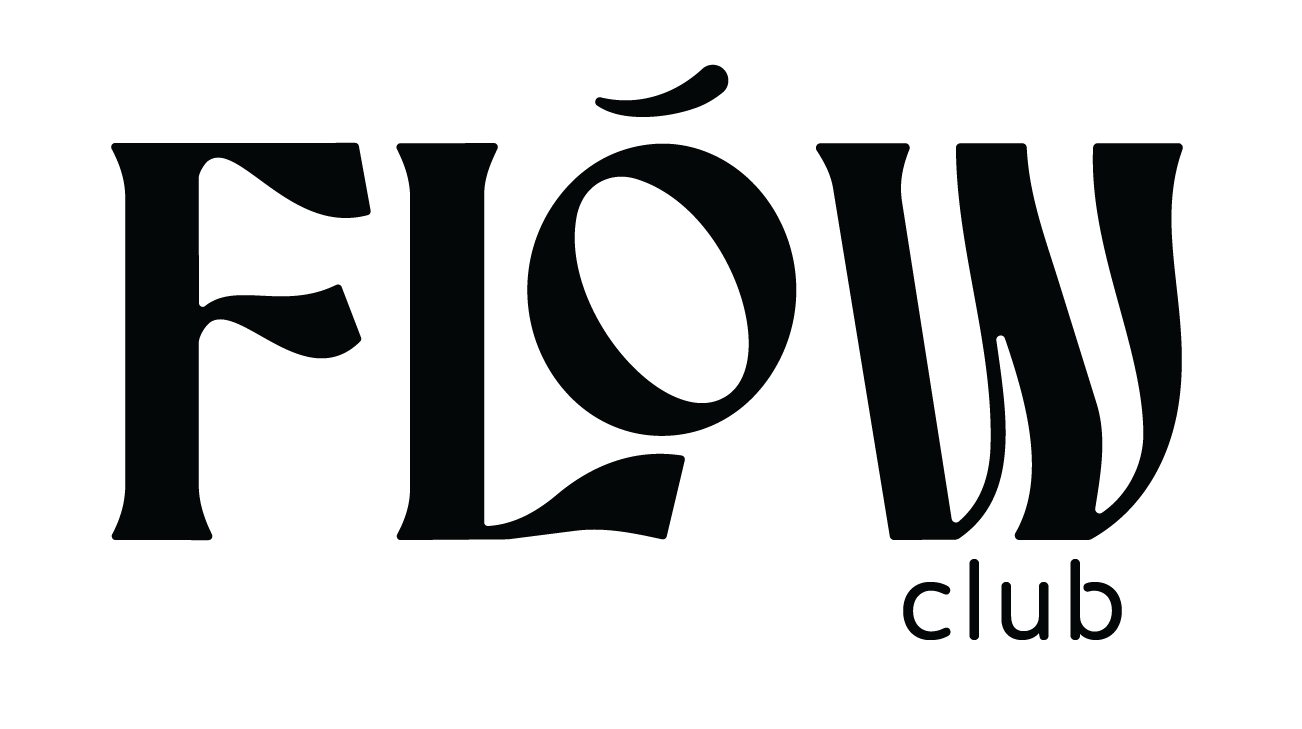
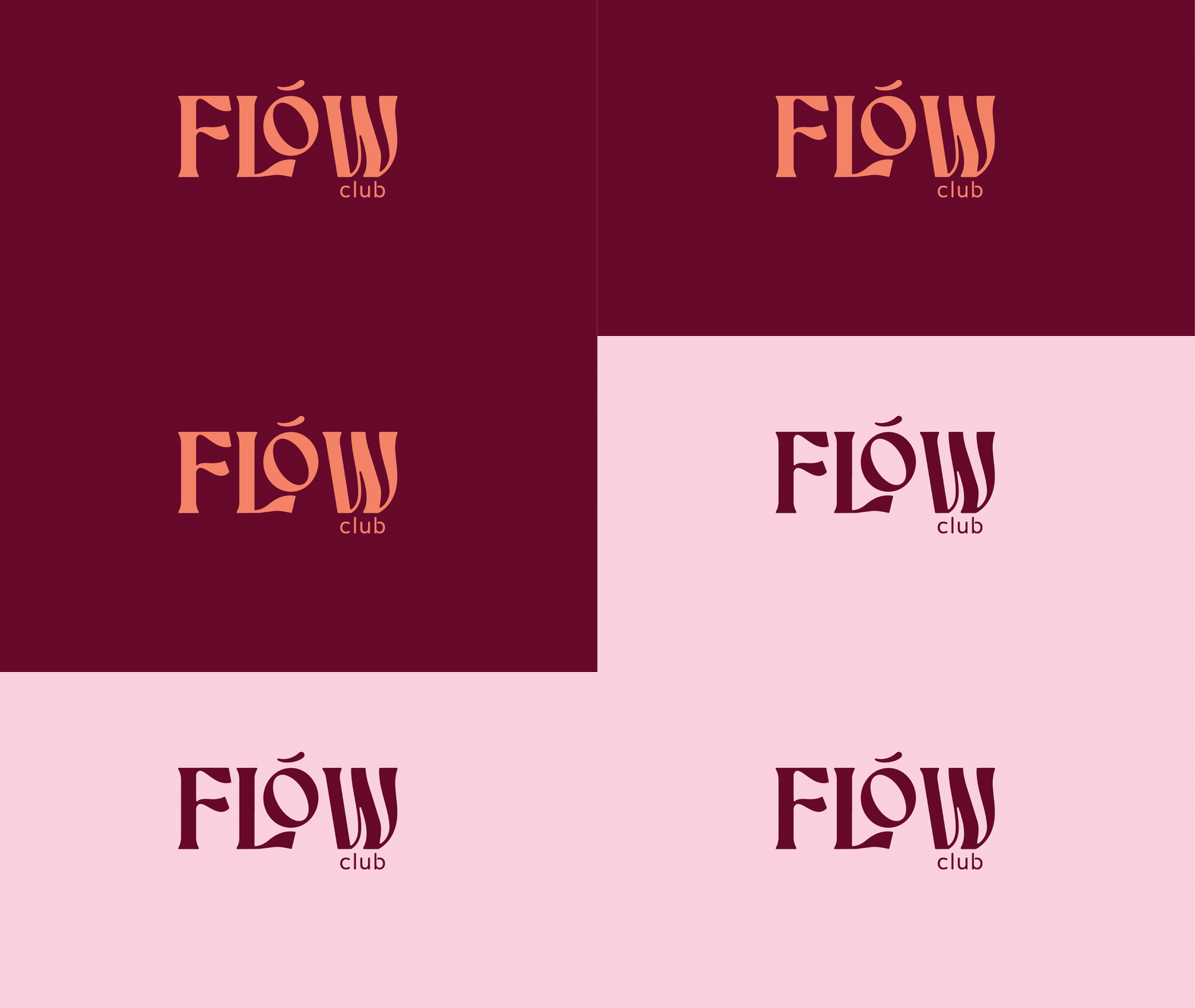
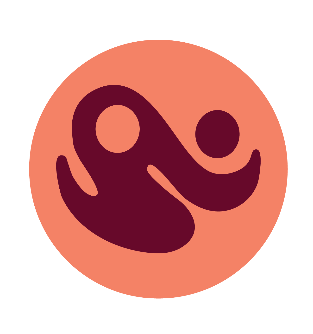

A logo for FLOW Club
an anatomy-first movement practice. I designed a family of abstract figures rooted in the curve of the spine, paired with a custom serif lockup. Warm and unmistakably human.
Custom serif logo design that reflects the intention of movement that the owner really wanted to emphasize with her practice
A set of custom imagery that is based around balance and symmetry
The primary icon is a abstract take on the yin-yang symbol that is modeled after the human form
Secondary icons are based on the human spine, abstract interpretations to mimic harmony and balance of the Flow practice